Skip to Main Content

Gridfor WinForms

Starting at
$1,409.95 US

Gridfor WinForms

Starting at
$1,409.95 US

The multi-talented and advanced Windows Forms datagrid/gridview control, with built-in report generator, editors, validation, and more. Highly extensible.

  • High-performance

  • Includes all the cell editor controls you’ll need

  • Built-in reporting

The quickest-loading grid with efficient memory usage and optimized drawing code for fast display, scrolling, and resizing.

interested ?

Description

Powerful

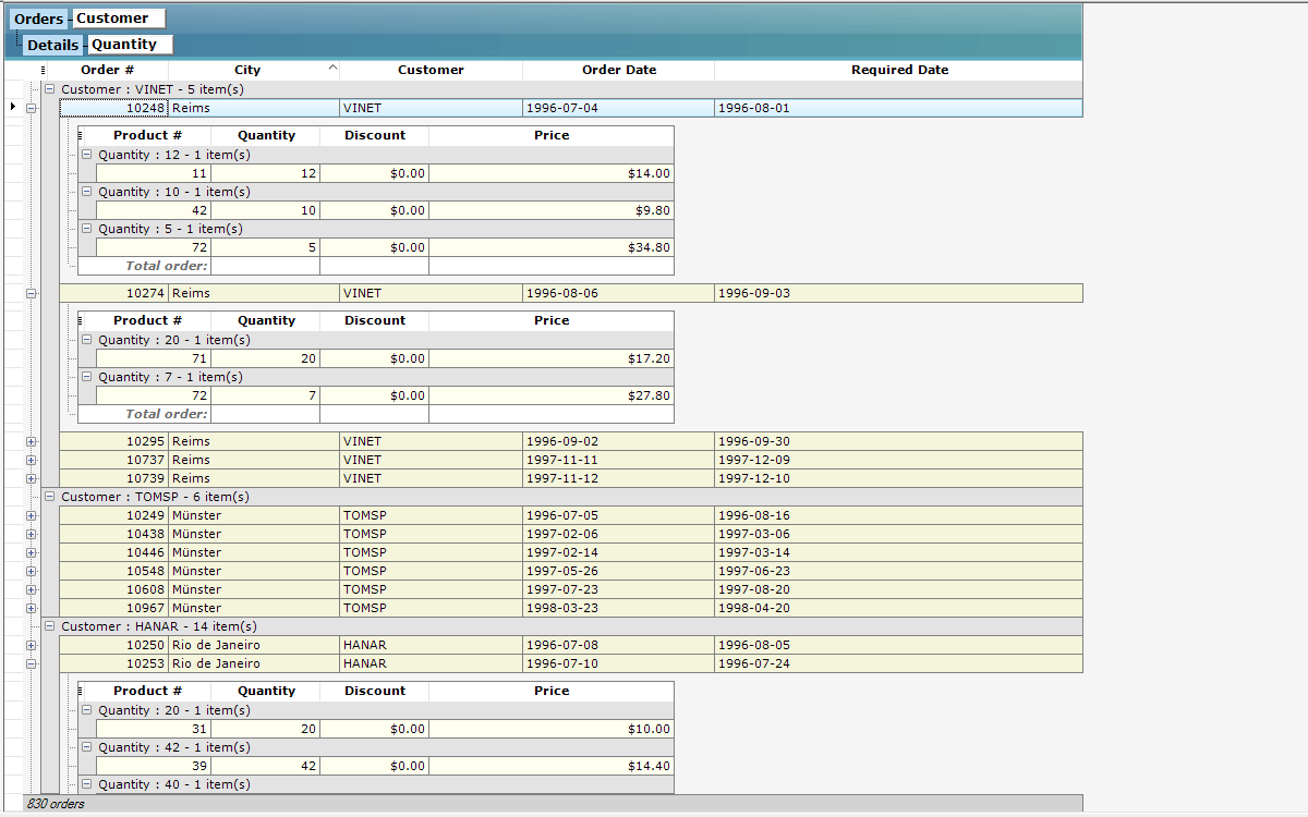
Provides over 120 features, including grouping, hierarchical master / detail, pixel-perfect Windows and Office theming, fixed rows and columns, Excel export, interactive visual styles, cell UI virtualization and other performance enhancements, and much more. Simply the most powerful .NET datagrid on the market.

It is the only grid with built-in reporting. Lets end-users generate, format, export (PDF, HTML, TIFF, and JPEG), and print reports from their grid-enabled apps.

Logical

Offers the industry’s most logically crafted and extensible .NET object model. Compatible with all .NET 4.X versions, as well as .NET Core 3.0 and up, and offers a separate build for .NET 2.0/3.5.

Editors

Includes a rich set of modular cell editor controls including multi-column combobox, rich calendar, etc. They are all usable outside the grid, too.

Trusted

Widely used for 15 years, including by Microsoft in many of their applications, such as Microsoft Office.

Features :

  • Written entirely in managed C# code. Source code included with the Blueprint subscription.

  • Includes plenty of VB.NET and C# samples.

  • Object-oriented design created exclusively for the .NET framework offers a fresh and modern approach to grid programming, not an ActiveX interface ported to .NET.

  • Supports .NET Core 3.0

  • Supports Microsoft Active Accessibility 2.0.

  • Comprehensive documentation fully integrated into Visual Studio.

  • All error handling works through .NET exception classes.

  • CLS compliant (Common Language Specification).

  • Does not use unsafe blocks for minimal permission requirements.

  • Fast loading object with efficient memory usage.

  • Optimized drawing code for fast display, scrolling, and resizing.

  • Supports regional settings including numbers, money type, dates, etc.

  • Supports form localization.

  • Integrates well into dashboard and business intelligence software.

  • Performance enhancements through cell UI virtualization, for shorter load times and decreased memory use. With a reference grid containing 10 columns and 100,000 data rows, load time is very fast, and memory use is minimal.

  • Delayed data-bound data row load with collapsed detail grids. Ultra-fast loading time.

  • Reporting engine built right into the grid. End-users can generate, modify, and print reports from their Grid-enabled applications. Developers can add this functionality in just minutes.

  • Support for Windows Aero theme.

  • The only true design-time WYSIWYG editor in a grid component. You can truly configure your grid right on the form without a configuration dialog or wizard. Set up your headers & footers, columns, grouping, master/detail views, insertion rows, styles, etc., quicker and faster than with any other grid.

  • Exclusive ability to assign any Windows Forms control as a cell editor or cell viewer. Not limited only to custom controls created specifically for use in a grid. Use any Visual Studio control or any of the wide variety of publicly available .NET controls.

  • All of the grid’s classes are inheritable and documented so developers can easily extend the grid’s functionality as needed. Sample applications demonstrating how to extend the grid are included.

  • Every visual element displayed by the grid is a distinct object that behaves like a separate control. Each element—including cells, rows, columns, groups, row selectors, header bars, etc.—receives its own mouse, keyboard, and paint events, and can be replaced by custom objects.

  • Sharp-looking master/detail hierarchy view that is so flexible that the grid can be used as a powerful bound or unbound TreeView control with limitless levels and sub-items.

  • A variety of specialized row, cell, and manager objects allow you to combine text and graphics anywhere on the grid for total control over the display.

  • Offers two ways to perform custom painting of visual elements: add extra painting code to a grid element’s paint event or inherit and override a visual element for complete control over the way it is drawn.

  • The Grid Assistant guides the developer through the basics of configuring and programming the grid right on the design-time form. It provides concise how-to descriptions to help developers get up to speed quickly without reading the manual.

  • Gradient maps with support for transparency to create the illusion of light, shadows, and smooth surfaces to the grid. Three stylesheets that take advantage of the gradient map feature are provided: Aero-like, Office blue, and Office silver.

  • Interactive visual styles that let the grid or specific parts of the grid react to the end-user: HotVisualStyle, SelectionVisualStyle, InactiveSelectionVisualStyle, and ErrorVisualStyle.

  • Export grid data to Excel XML spreadsheet files (directly or via a stream). Windows will automatically recognize these specially formatted files as Excel files and open them in Microsoft’s popular spreadsheet application.

  • Control the appearance of exported spreadsheets: column header style, how detail grids and cell data are displayed, ability to export the style of the GridControl.

  • Define custom styles for spreadsheets.

  • Events for every step of the spreadsheet export and for changes in the various properties of the Excel exporter are provided.

  • Classes that give you precise control over individual XMLSS attributes for future extensibility and tweaking are also provided

  • Instant reports: Instantly provide your application’s users with the power to print, preview, and export customized reports right from Xceed Grid for WinForms. Because they are built-in, Xceed Grid’s reporting capabilities eliminate the need for you to acquire, learn, and implement a separate reporting solution with your application.

  • Exporting: Export reports to PDF, HTML, Multi-page TIFF, and JPEG.

  • Vector-based printing: Unlike the printing capabilities of other grids, which send the actual grid mostly in bitmap form to the printer, Xceed Grid’s reporting engine generates a new layout and sends vector-based data to the printer. This results in professional-looking reports that scale to the printer’s resolution instead of looking like someone used the “print screen” key.

  • Ready for end-users: With only a single line of code, developers can enable Xceed Grid for WinForms’ built-in, user-friendly “Generate Report” and “Customize Report Style” dialogs, allowing end-users to “skin” their reports before printing or exporting them, or to create their own customized report stylesheets.

  • Flexibility for end-users: End-users can configure the printed appearance of all report elements, select colors and fonts, add images, determine which data fields to print, define field widths, add lines, customize the report header and footer areas, and more.

  • Programmatic control: The grid’s Report classes allow developers to programmatically generate, print, export, and extensively customize reports to a level even deeper than what’s available in the end-user forms.

  • Load/save as XML: Stylesheets can be loaded and saved as XML files, either programmatically or through the built-in end-user forms.

  • Custom headers/footers: Place images and text in page headers and/or footers, with macros for page number, report title, and a variety of date and time formats.

  • Column formatting: Choice of either multi-line layout or squeeze layout when there are too many fields to fit on a page. Multi-line layout wraps a row’s cells over two or more lines, and squeeze layout vertically stretches cells, wrapping only their contents.

  • Page spanning: If there are too many fields to fit on one page, the fields can span two or more pages.

  • Summary row: New extensible summary row object for the grid includes 14 types of built-in statistical functions such as sum, running sum, count, and average. This row can be placed at the bottom of each page, at the bottom of each group, at the top, or anywhere that makes sense for your report.

  • Repeat on each page: Any row can be repeated on each page, such as column header rows, group header rows, and summary rows.

  • Keep together: Ability to prevent splitting groups over two pages if possible.

  • Insert page breaks: Insert a page break before and/or after any row or group.

  • Grid lines: Add horizontal line types below or above any row, header, group, or summary cell.

  • Print selected fields: Select which fields are printed in reports and specify their widths.

  • Customizable forms: The source code and instructions for customizing the end-user forms is included, allowing developers to customize the forms to match their application’s look and feel.

  • Display, edit, and work with bound data, unbound data, or a combination of both simultaneously.

  • Detail views in a Master/Detail grid configuration can also be bound, unbound, or both.

  • Same programming model whether you deal with bound or unbound data.

  • Can be bound directly to an array of simple types such as String, Decimal, DateTime, TimeSpan, Guid, or Primitive (e.g., SByte, Byte, Int32, etc.), and will show the value of those types in one column.

  • Automatically obtains and synchronizes bound data from any .NET source, including Jagged Arrays, any object that implements IListSource or IList, and any ADO.NET DataSet, DataTable, DataView, or DataViewManager object.

  • Fixed column support lets you choose columns that will remain visible while you scroll horizontally, for maximum flexibility in data visualization. Just drag columns to the left of the FixedColumnSplitter glyph, move the glyph itself, or set things up programmatically. Fixed columns are repeated on printeds page if there are too many to fit page width.

  • Summary row to display sums or the results of statistical functions in the grid. Various built-in statistical functions. Complete infrastructure for the development of custom summary rows.

  • Includes a variety of modular, high-quality editor controls to use as cell editors/viewers. They are also usable outside of the grid. See Editors section below for features.

  • Built-in input validation. See Input Validation section below for features.

  • Hide the focus rectangle of the grid, also custom paint a cell’s focus rectangle.

  • Reserve an in-place space for the form’s resizing gripper in the lower right corner of the grid.

  • Outlook-style automatic row grouping, or custom grouping to allow your code to group together rows with your own conditions.

  • Logical, easy to use hierarchical master/detail views.

  • Master/detail views support multiple detail views per row or level.

  • Sort one or multiple columns according to any criteria.

  • Scroll grid’s view to any cell, row, group or column.

  • Fast display speed, fast sorting.

  • Single-click edit mode allows entering edit mode and activating items such as check, text, and combo boxes with one click.

  • Real-time scrolling and always synchronized scrollbars.

  • Detail grids do not display a second set of scrollbars and also stay in view when horizontally scrolling the parent grid.

  • Detail grids can be independent or can automatically synchronize with each other so that they all have the same columns, column order and configurations, sorting, and grouping.

  • Ability to change each individual cell’s formats and styles.

  • Display customizable cell or row-level errors. Can display tooltips, blink cell backgrounds, show the standard error icon, etc.

  • Insertion Row allows end user to quickly enter data and insert a new row item in the grid.

  • Fixed, non-scrolling header and footer regions you can put any number and type of row in.

  • Print and print preview including ability to print a range of pages.

  • When there are too many columns to fit on one printed page, ability to split columns at specific point to decide which go on the next page.

  • Display a background image under any visual grid element with optional alpha blending.

  • Add custom statistical functions (sum, average, etc.) to any of the grid cells.

  • Intercept, parse and modify data being synchronized with the database from the grid.

  • Full support for mouse, keyboard, and drag & drop events on any visual grid element.

  • Every grid element includes its own tag property for custom user data.

  • Groups have their own completely extensible visual margin element.

  • Interactive, hierarchical “Group By” row allows users to easily define their own groups and master/detail relationships.

  • Stylesheets with information about the grid’s visual elements, such as colors, fonts, background images, borders, and styles.

  • Load a grid’s visual configuration from one of the predefined stylesheets or from your own custom stylesheet.

  • Visible, invisible, and patterned grid lines and master/detail relationship lines.

  • Extensible cell row, cell-less row, column, group, detail grid, and other objects that you can fully customize.

  • Grid elements can be read-only to prevent any portion of the grid from being edited.

  • Ability to automatically change a row’s height to fit the contents of the largest cell.

  • Easy manipulation of the grid’s current row.

  • Query which section of a grid a row is in.

  • Plenty of meaningful edit events for both rows or cells.

  • Grid can pre-generate a list of columns from a type.

  • Built-in Bitmap column data type makes it a snap to display bitmaps in a column.

  • Ability to hide the (+/-) symbol on desired DataRows.

  • Data filtering capabilities.

  • All included editor controls are usable either as cell viewers / editors, or independently outside of the grid for a more flexible and uniform interface.

  • Includes buttons, resizeable combobox, multi-column combobox, date picker, multi-month resizeable calendar, resizeable and masked textbox, numeric textbox, calculator, check boxes, scrollbars, and panel building block.

  • Combinability/modularity: Embed controls into one another to create flexible, innovative new controls.

  • The grid automatically picks the correct type depending on the data type of the column.

  • Fully visual approach: Powerful designers help make development faster and easier.

  • Dropdown feature: Any editor control can dropdown any other control, allowing for absolute flexibility and innovation.

  • Extensibility: All controls can be extended to implement custom features, appearance, and behavior.

  • Themes: Support for Windows XP and Windows Classic themes and the ability to adapt to the current Windows theme.

  • Composite control examples included: Custom calendar, option textbox, option picker, picture viewer, scrolling text box, spin edit, customized dropdown combobox, toolbar, stretchable agenda.

  • Auto-complete capabilities.

  • Fully visual approach to implementing cell-level input validation.

  • Validation error messages are overridable and localizable.

  • Wide variety of operators and options available when setting up validation criteria.

  • Validation of criteria is available either when focus leaves a cell or when a general validation method is called.

  • Expandable by deriving from ValidationCriterion or ValidationExpression classes.

  • True WYSIWYG design-time editor

  • Completely set up the grid’s visual elements and configure their appearance directly on your form without the use of a separate wizard or custom property editor. Just click on an element to view and edit its properties in the property editor.

  • Multi-select grid elements to view and edit their common properties.

  • Add, copy, and delete grid elements as needed.

  • Undo operations.

  • Drag & drop repositioning of grid elements.

  • Resize, rearrange, and sort columns, resize rows

  • Create, edit, delete, expand, and collapse groups.

  • Create, edit, delete, expand, and collapse master/detail views.

  • Create alternating row styles for two or more data rows in the main grid or in master/detail views.

  • Easy access to event-handling code of any particular grid element.

  • Style previewer allows you to base your grid’s look on a predefined grid style.

Join more than 100,000 satisfied customers now!

IBM
Deloitte
Microsoft
NASA
Bank of America
JP Morgan
Apple