Xceed is excited to introduce its new Toolkit for MAUI.
The Xceed Toolkit for MAUI is an open-source and free version that offers additional user interface controls and features to supplement the existing basic controls in MAUI. The main objective of the Xceed Toolkit for MAUI is to provide developers with the necessary tools to create exceptional user experiences.
The toolkit is designed with developers in mind, aiming to be user-friendly and intuitive. Whether you're an experienced developer or just starting, you'll find that the controls and features are easy to use and integrate seamlessly into your projects.
MAUI's cross-platform capabilities allow you to develop applications that work smoothly on Windows, Android, Mac, and iOS, eliminating the need for separate code bases. Xceed is committed to ensuring that the toolkit is compatible with all MAUI-supported platforms, providing an identical experience across all of them.
For developers familiar with WPF, the toolkit aims to offer a familiar experience and a seamless transition as it is offered by our Xceed Toolkit for WPF. The goal is to provide a comfortable and intuitive experience, making it easy to get started and be productive quickly.
Currently, the Xceed Toolkit for MAUI includes a range of controls, with plans for more in the future. Some of the controls included are:
Border: Offers additional features such as a BorderBrush property of type Brush, a BorderThickness property of type Thickness for independent borders, and a CornerRadius property of type CornerRadius for rounded corners.
|
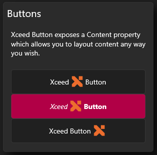
Button: Provides essential features missing in the default .NET MAUI Framework Button, including MouseOver and pressed styles, custom content support (such as images), BorderBrush for flexibility, BorderThickness for independent borders, ClickMode for triggering events on press or release, and more. |
 |
ToggleButton: An implementation of the ToggleButton control that includes the same functionalities as the custom Button implementation. It introduces an "IsChecked" property for a "pressed" appearance, enhancing the user experience.
RepeatButton: A control derived from the Xceed Button, which allows the Clicked event to be raised more than once. It includes the Delay and Interval properties to control the timing of the repeated Clicked events.
|
RepeatButton: A control derived from the Xceed Button, which allows the Clicked event to be raised more than once. It includes the Delay and Interval properties to control the timing of the repeated Clicked events. |
 |
ContentControl: A versatile control that can display any type of content, including text, images, and other controls. It allows you to set the content and its associated DataTemplate, enabling highly customized and dynamic user interfaces.
ButtonSpinner: A control derived from ContentControl, which includes two RepeatButtons (Spinners) along with content. It provides properties and events for customization, allowing you to create interactive and customizable UI components.
Card: A visually appealing control that provides a frame with a subtle shadow effect, creating the illusion of depth. It enhances the presentation of content and is suitable for displaying important information or creating visually striking user interfaces.
Xceed is dedicated to continuously improving and updating its Toolkit for MAUI to meet the evolving needs of developers. We encourage developers to explore and utilize Xceed's Toolkit for MAUI, provide any comments and feedback you may have, and we are excited to see what developers will create with it.
Xceed Team